"They'll eat you out of house & home! Their food bill will put you in the poor house! ... And they never gain an ounce!" - That's what my friends say about their teenage sons. They're probably exaggerating a little, but since it's a recurring theme, there's probably some truth to it, eh? Let's have a look at the data...
I did some web searching and found an article on fivethirtyeight.com related to this topic. It had a graph showing the number of calories we need per day, based on age and activity level. Here's their graph for Males.
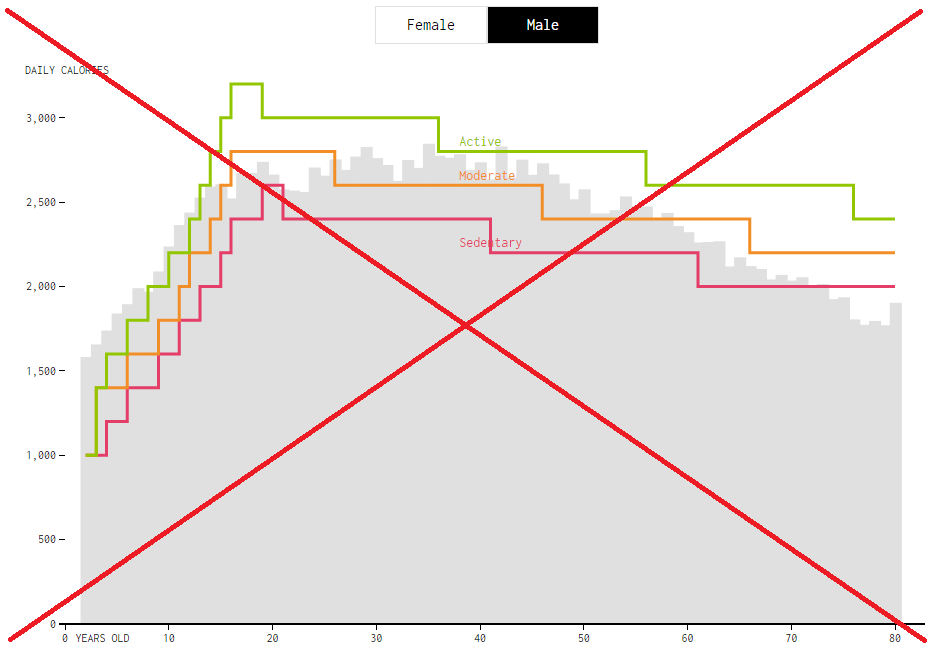
My biggest complaint with the graph is that it is very blocky. True, the data itself is somewhat blocky, but we intuitively know that you don't suddenly go from needing a certain number of calories, to needing several hundred more (or less) - the change is probably a bit more smooth/continuous. The original graph uses a step interpolation, where the line stays at the current level until it reaches the next data point, and then goes straight up/down to it (like stair steps).


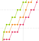
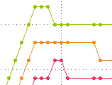
Rather than a step interpolation, I would recommend using a simple join interpolation, connecting each data point with a straight line. Now, rather than the Moderate and Sedentary lines touching in several spots, they have a slight gap between them, and show smoother transitions. I think the graphs are much easier to read, and more visually pleasing. Here are the same sections of the graph, using a simple join interpolation rather than a step interpolation.
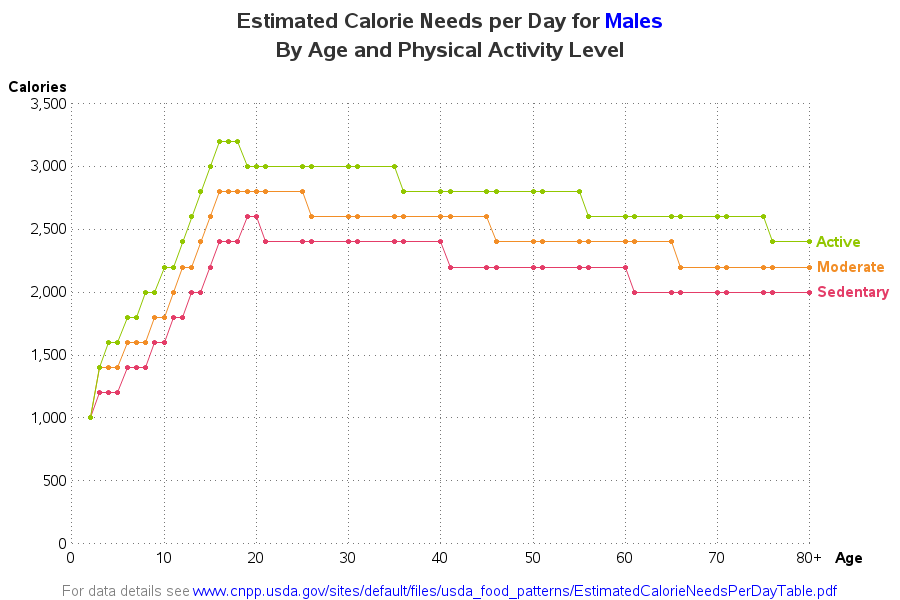
Below is my complete version of the graph, using data from a table I found on the usda.gov website. Here are a few of my improvements over the original graph:
- I add a title describing what's in the graph (so you don't have to read the entire article to know what it represents).
- I use the join interpolation, which produces smoother transitions than the step interpolation.
- I add a reference line grid, so you can more easily determine which age and calorie range corresponds with which section of the graph line.
- I leave out the average gray bars/area - there are just too many unanswered questions in my mind about what makes up the average.
- I make my line/color labels easier to read.
According to this data, active young men in the 16-18 age range need 3200 calories per day. That's 1000 calories a day more than a less-active middle aged man - that would certainly explain the phenomena my friends with teenage sons have mentioned! Where are you on this graph? Does it sound about right? I remember that at ages ~26 and 45 I had to start cutting down on snacks and desserts, to keep from gaining weight - that's right in line with what these graphs are saying.
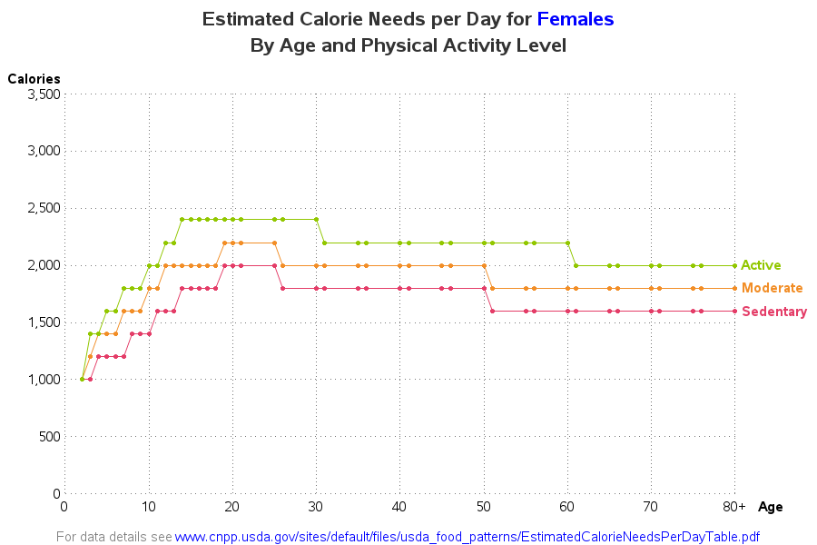
And just in case you're curious, here's the calorie graph for females. Note that rather than auto-scaling the y-axis, I plot it to the same scale as the male graph, so the two graphs can be compared.
So, what's your favorite high-calorie indulgence? Have you ever splurged on a dessert that contained your whole day's worth of calories?
I asked my friends if they had any high-calorie examples, and here's what they (Samantha, Eva, Becky, Mubarra, Claudia, and Beth) came up with - hungry yet? :)