With the Pokémon Go craze sweeping the world, techies and programmers are looking to apply their skills to gain an advantage over the average user. In this blog post, I show how to use some of SAS' geospatial analytics capabilities to capture a Pikachu.
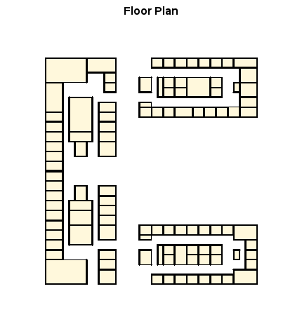
Let's say you know of a building that has an active Pokéstop with verified Pikachu sightings. First, you'll want to obtain (or create) a floor plan, and save it in an image file (png, jpg, gif, etc).
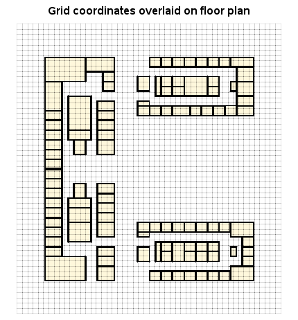
Next, you'll want to come up with a convenient coordinate system, and create a grid of unit cells by looping through the grid values in a SAS data step loop, and output 4 coordinates and an id variable for each cell. You can then use Proc GMap to draw the grid, and annotate the image of the floor plan behind the grid (here's my code).
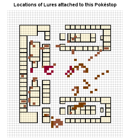
Now you'll need to start collecting geospatial data that you can plot as colored areas on the grid. Here, I have determined the x/y grid locations of lures attached to this Pokéstop, and plotted them as dark brown areas on the grid. Can you detect any clustering or trends here? (Note that my friend Kenny, who was a professional/paid gamer, helped me with the finer details of this analysis.)
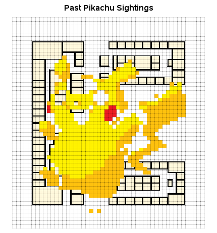
Next, I collected data about verified, and suspected, Pikachu sightings. I plotted the verified sightings in red, and the suspected sightings as yellow and orange. These sightings definitely seem to be most dense in a certain area of the lobby (red), and then become less dense as you go out from that location (yellow, then orange). The results resemble a contour or gradient heat map.
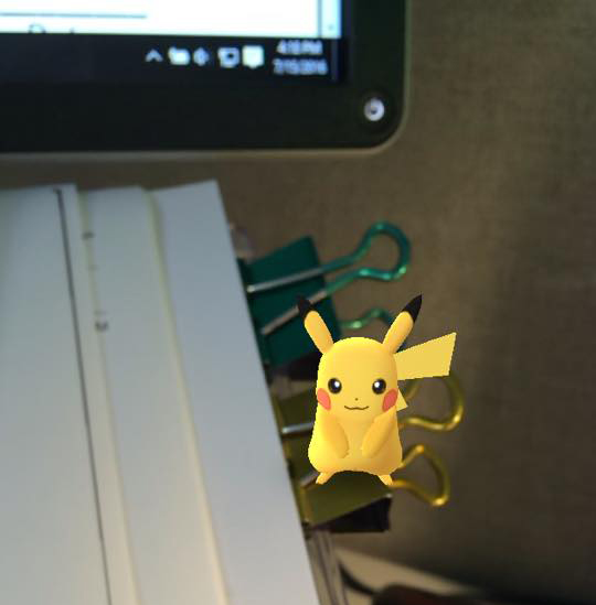
Here's an example of one of the verified Pikachu sighting, from my friend Jennifer N.
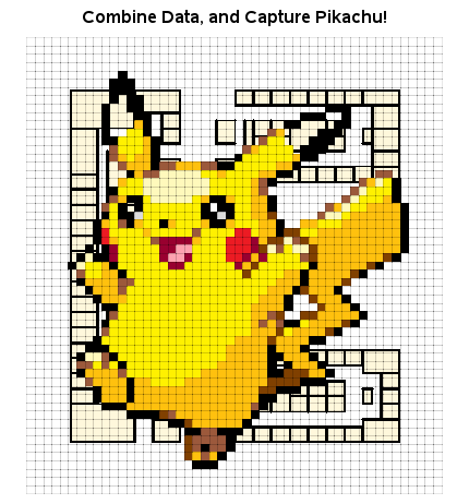
And when you combine the two graphs above, look what you've got - you've captured (an image of) a Pikachu! I bet you didn't see that coming! (Note that I used the template from yusufisik.com for the Pikachu design.)
OK - I apologize profusely for tricking you like that ... but, I thought it would be a great idea to have a little fun, while learning what you can do with analytics.
If you have geospatial data (Pokémon or otherwise), you really can use these SAS graphing techniques to plot and analyze it. You probably won't get a picture of a cute Pikachu when you're done, but you can gain lots of insight about your data.
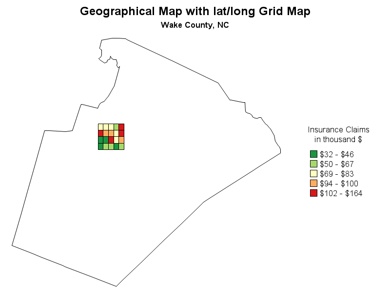
For example, here's a mock-up of insurance claims after a storm in Wake County:
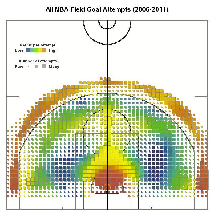
And here's a similar technique applied to basketball data:
What other kinds of data might you analyze using techniques like this (overlaying grids on floor plans and maps)? Perhaps you have some similar techniques and tips you'd like to share?


4 Comments
I work in the Biopharmaceutical industry. I am often asked to extract data from published graphs from which the raw data is proprietary. I love this article! Instead of Pokeman, I used the competitor's image, and overlayed a grid. Although it's still a tedious activity, I'm now able to more accurately estimate the raw data from the competitor, which gives us a better idea of how our competition is faring. Thanks!
Ahh! - Very nice adaption of the technique!
Pingback: A statistical crossword puzzle to exercise your brain - SAS Learning Post
Pingback: Most efficient way to find rare Pokémon - SAS Learning Post