Smallpox was declared eradicated in 1979, after an extensive vaccination campaign in the 19th and 20th centuries. This blog post contains a visual analysis of the final years of this disease in the US ...
In my previous blog post, I imitated and improved infectious disease graphs from a recent Wall Street Journal article. I focused mainly on measles in that post - I now focus on smallpox. Here's my calendar chart of the smallpox data from the Tycho website.
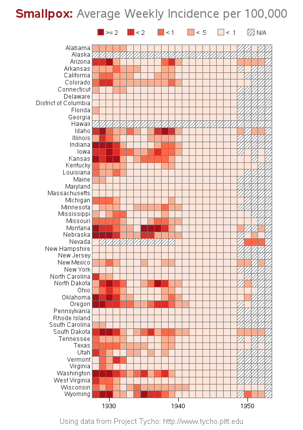
I noticed in the calendar chart (above) that there are several states with consistently low values of smallpox incidence across most of the years. I wondered if there were possibly geographical groupings of the states that did/didn't have high smallpox incidence rates, and used Proc GMap to plot the data on a map. It was cumbersome to manually scroll through maps to see how that changed over time, therefore I converted the maps into a GIF animation, which showed the geographical trends over time very nicely (click the map below to see the animation).
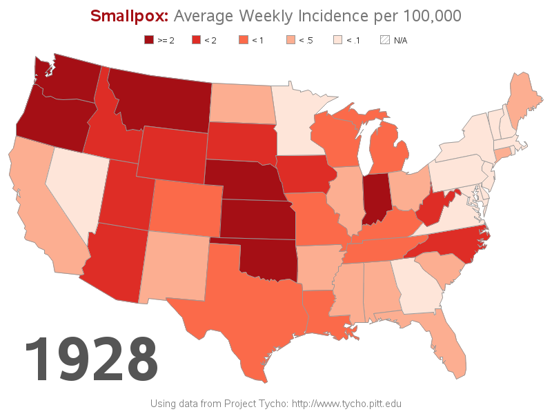
So, what are your theories about the data presented in the GIF animation? Why did the states along the eastern side of the US seem to have lower incidence rates than the states in the western half of the country? What about states with more urban -vs- rural populations? Do you think there was any difference in record-keeping in the various states? (note that this was 1928-1953 ... quite some time ago) Anyone have any inside-info or keen insight into issues that might have affected the data collection back then?

6 Comments
Hi,
How to do similar things when you have monthly data for 3 years?
Thank you
Similar to this example of yearly data, I've also got examples of custom calendar grids of daily data ... but I don't think I've created any of monthly data. It would just be a matter of programmatically working out the x/y coordinates for a box for each month. (Perhaps I'll work on such an example in the near future!)
"I converted the maps into a GIF animation" - can you do that with SAS or did you use some other software?
This is a feature built-in to SAS! :)
Here are several other examples of GIF animations I created using SAS' built-in features:
http://www.robslink.com/SAS/democd27/aaaindex.htm
A marvelous pair of charts by The Grand Master of SAS/GRAPH.
I like the fact that the shades of red are limited to five. It's a fact that the human eye has difficulty reliably distinguishing more than five shades of the same hue.
Despite this fact, one does encounter graphs or charts using more than five shades, and sometimes even a continuous range of shades.
Thanks for the excellent use of color.
Animation is a great tool for dealing with time as a third dimension, rather than trying to use some sort of 3D plot.
Thanks LeRoy!