As we continue to process and understand the ongoing effects of the novel coronavirus, many of us have grown used to viewing COVID-19 dashboards and visualizations, including this popular coronavirus dashboard from SAS.
If you are more accustomed to building graphs and visualizations using the SGPLOT and SGPANEL procedures, this post is for you. The purpose of this article is to demonstrate the use of the SGPLOT and SGPANEL procedures to visualize the data related to COVID-19. The examples included in this post are meant for purely demonstration purpose and not intended for any medical guidance. These examples in this post rely on the following publicly available data from COVID-19 Data Repository by the Center for Systems Science and Engineering at Johns Hopkins University and "Coronavirus Pandemic (COVID-19)" - Max Roser, Hannah Ritchie, Esteban Ortiz-Ospina and Joe Hasell (2020)
Although there are many ways to visualize the data, I discuss the following graphs:
- Rolling averages for confirmed cases and deaths.
- Scatter plot for total tests against total cases.
- Animated plot.
Rolling Averages for Confirmed and Death Cases
A plot of rolling averages helps in visualizing smoothed data. Figure 1 shows a single-celled plot of 7-day rolling average for new cases grouped by countries. You can also create a panel of graphs driven by a classification variable using the SGPANEL procedure. The data driven panels provide a comparative picture of the measure across different values of the classification variable. Both types of plots are discussed below.
Preparing the data – The data comes from the github repository maintained by folks at the Johns Hopkins University. I have downloaded the time series datasets for confirmed cases and death cases. After re-shaping the data to suit the structure desirable for plotting purpose, I used the EXPAND procedure to calculate the rolling average.
Plotting the Moving Averages for New Confirmed Cases – Although I created the plots for a few countries, you can be easily add more by making minor changes to the code. The SGPLOT procedure can be used to generate a standalone plot of the moving averages for each country. The averages are drawn with the help of the SERIES statement. The GROUP option in series creates separates trajectories for each country.
proc sgplot data=work.rollingavg subpixel; series x=date y=confirmed_mean7 / lineattrs=(thickness=2px pattern=solid) group=country name="series" legendlabel="7-day rolling average" ; keylegend "series" ; where country in (&country); xaxis grid type=time display=(nolabel); yaxis grid label="Confirmed new cases"; run; |
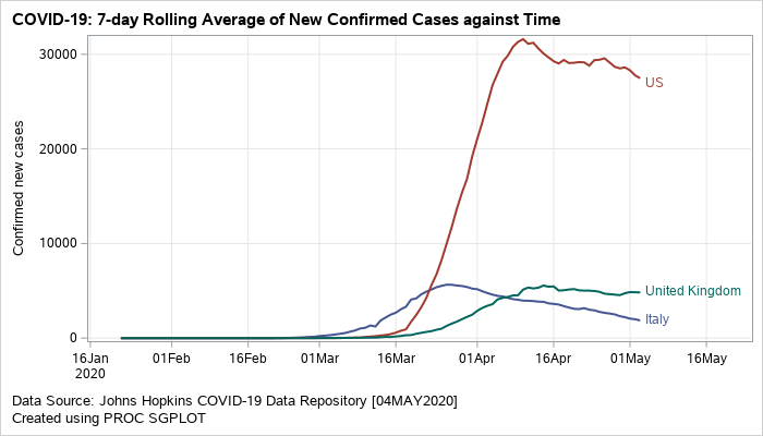
Figure 1: Grouped series plot displaying rolling averages of new confirmed cases.
A similar plot can also be created to visualize the rolling average for new death cases.
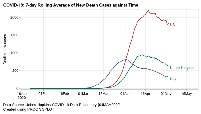
Figure 2: Grouped series plot displaying rolling averages of new death cases
The next visual (Figure 3) is a data driven panel of plots based on the classification variable country. This is created using the SGPANEL procedure. Separate cells are created for each country based on the classification variable specifed on the PANELBY statement. The composite plot within each cell is an overlay of barchart and series plots. VBARPARM is used to create the bars for the confirmed cases. The bars are color coded based on the COLORRESPONSE variable. This may help in conveying the information on the total death counts in addition to displaying the confirmed cases. The SERIES statement is used to overlay the 7-day rolling averages.
proc sgpanel data=work.rollingavg noautolegend; format blockdate monyy.; panelby country / novarname columns=1 onepanel uniscale=column noheaderborder noborder headerattrs=(weight=bold); block x=date block=blockdate / filltype=alternate nooutline valuehalign=right nolabel novalues transparency=0.3 valuefitpolicy=truncate valuehalign=left; vbarparm category=date response=confirmed_new_cases / outlineattrs=(color=white) fillattrs=(color=orange) colorresponse=deaths_new_cases colormodel=(lightyellow orange lightred red) name="bar"; series x=date y=confirmed_mean7 / lineattrs=(color=black thickness=2px pattern=solid) arrowheadshape=barbed name="series" legendlabel="7-day rolling average"; gradlegend "bar" / position=bottom title="Deaths new cases"; keylegend "series"; where country in (&country); colaxis type=time display=(nolabel); rowaxis label="Confirmed new cases"; run; |
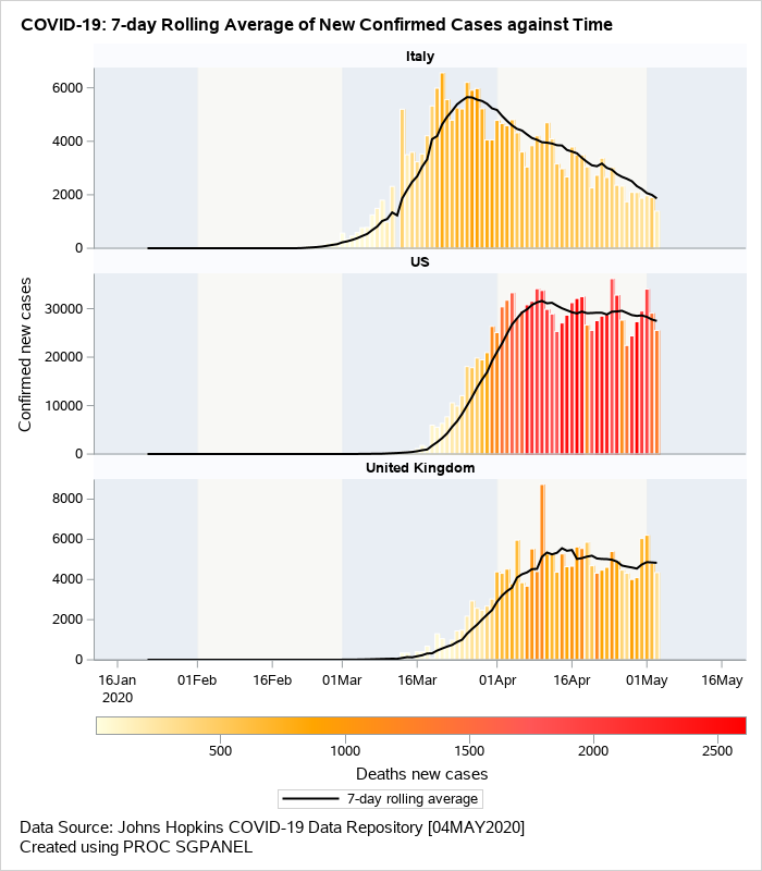
Figure 3: Overlaid barchart/series displaying rolling averages of new confirmed cases.
Scatter Plot for Total Tests against Total Cases
The next example shown in Figure 4 is a scatter plot of total tests against the total cases on 03MAY2020. This visual uses the logarithmic scale for both X and Y axis. The reference lines shown on the plot indicate the number of tests that are fixed ‘N’ number of times larger than the confirmed cases where N=2, 5, 10, 20, 50, 100. The data labels for each marker display the country name and are colored by region.
Preparing the data – The original downloaded data for the confirmed cases and number of tests is available here. The dataset has the information about the total tests and total cases. You can read more about the testing data here. I wrote a small macro program to create the dummy data for reference lines with varying slopes and merged it with the original data. I also created an attribute map dataset to add custom colors to the plot.
Plotting Confirmed Cases against Total Tests – The SCATTER statement is used in the SGPLOT procedure to generate the plot of total tests against the total cases confirmed. The attribute map dataset is consumed by the SGPLOT procedure to control the colors of the circled markers in the plot. The axis type for both X and Y axes are set to logarithmic scale. This is easily done by using the option TYPE=LOG on both XAXIS and YAXIS statements. To plot the reference lines, I wrote a macro program that overlays multiple SERIES statement using the dummy data I created during the data preparation step. ASPECT=1 in the SGPLOT statement makes the graph square.
proc sgplot data=work.covid noborder nowall dattrmap=attrmap aspect=1; %drawrefline; scatter x=Total_cases y=Total_tests / group=continentExp grouporder=ascending attrid=myid datalabel=location markerattrs=(symbol=circlefilled) name="scatter"; yaxis type=log label="Total Tests (LOG scale)" min=500 valuesformat=best12. offsetmax=0.01 ; xaxis type=log label="Total Cases (LOG scale)" min=16 valuesformat=best12. ; keylegend "scatter"; where date eq '03MAY2020'd ; run; |
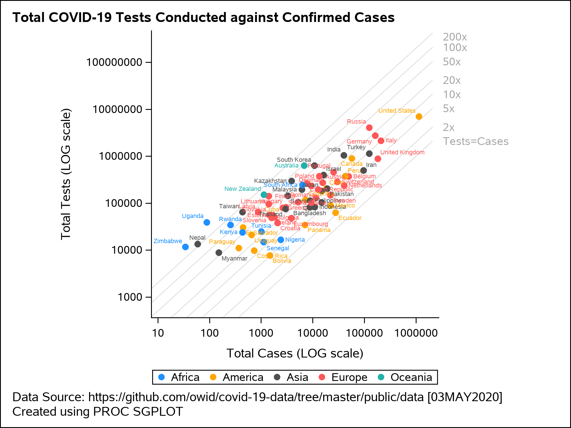
Figure 4: Scatter plot displaying total tests against total cases on a LOG scale
Animated Plot
Figure 5 shows an animated trajectory of the tests performed against confirmed cases. The data for animated plot is derived from the previous plot shown in Figure 4. A SERIES statement is used to display the trail. This plot uses a BY-group processing to create a sequence of graphs by looping through the values of date in the data. The animated GIF can then be created using the ODS PRINTER destination. Plotting all of the data can increase the size of the GIF file for the article. To keep the file size within the limits, I have considered the data only for United States, United Kingdom and New Zealand.
options papersize=('6 in', '6 in') nodate nonumber animduration=0.25 animloop=yes noanimoverlay printerpath=gif animation=start; ods printer file='covid.gif'; ods graphics / width=6in height=6in imagefmt=gif antialiasmax=1000000 labelmax=600; ods html select none; title "Total COVID-19 Tests Conducted against Confirmed Cases"; footnote1 "Data Source: https://covid.ourworldindata.org/data/owid-covid-data.csv"; footnote2 "Created using PROC SGPLOT"; proc sgplot data=work.covid_Animated noborder nowall subpixel aspect=1 noautolegend; %drawrefline; series x=total_cases y=total_tests/ group=iso_code grouporder=ascending curvelabel arrowheadshape=barbed lineattrs=(pattern=solid thickness=1px) arrowheadpos=end arrowheadshape=filled name="series"; yaxis type=log label="Total Tests (LOG scale)" min=1000 offsetmin=0.01 offsetmax=0.01 ; xaxis type=log label="Total Cases (LOG scale)" min=32 offsetmin=0.01 offsetmax=0.01 ; by Animation_Date; where iso_code in (&country) and (animation_date ge '07MAR2020'd); run; title; footnote; ods html select all; options printerpath=gif animation=stop; run; ods printer close; ods printer close; |
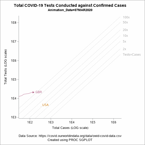
Figure 5: Animated plot displaying total tests against total cases on a LOG scale
Conclusion
The coding-based approaches described in this post using the SGPLOT and SGPANEL procedures can be leveraged to create visualizations related to COVID-19. With some additional work on the preparing the data, the visuals can be customized to suit the requirements of the plot.
You can download the full code for Figure 1, 2 and 3 prog1 and for Figure 4 and 5 prog2 here.