This post shows you how to use PROC SGPLOT (along with multiple axes and offsets) to display multiple plots in the same graph and use range attribute maps. There are two types of attribute maps: discrete and range. You can use a range attribute map to control the mapping of the values of a continuous variable to colors. Sanjay and I have both discussed discrete attribute maps before. Examples: Roses are red, violets are blue and Consistent Ordering of All Graph Components. Sanjay has also discussed range attribute maps, which first became available in 9.4M3. Example: Attributes Map - 3 Range Attribute Map. Search Graphically Speaking for more examples.
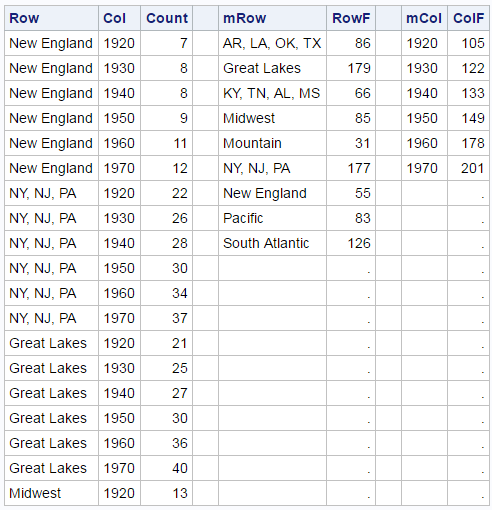
This is my first time using a range attribute map. In this blog, I display a crosstabulation of two variables along with the marginal frequencies for each variable. You might want to create a graph like the ones shown here to augment the results from PROC FREQ or PROC CORRESP. All three plots appear in the same graphical display. The crosstabulations are displayed over a heat map so that larger values are easily seen. The same colors are used in the bar charts of the marginal frequencies. The challenge when displaying graphs, each having quite different values (row and column marginal frequencies are larger than the cell frequencies), is using colors consistently across all three graphs.
The data come from the second example of PROC CORRESP.
data pop(drop=f: i);
   input Row $ 1-18 f1-f6;
   array f[6];
   do i = 0 to 5;
      Col   = put(1920 + i * 10, 4.);
      Count = round(f[i+1] / 1000);
      output;
   end;
   datalines;
New England         7401  8166  8437  9314 10509 11842
NY, NJ, PA         22261 26261 27539 30146 34168 37199
Great Lakes        21476 25297 26626 30399 36225 40252
Midwest            12544 13297 13517 14061 15394 16319
South Atlantic     13990 15794 17823 21182 25972 30671
KY, TN, AL, MS      8893  9887 10778 11447 12050 12803
AR, LA, OK, TX     10242 12177 13065 14538 16951 19321
Mountain            3336  3702  4150  5075  6855  8282
Pacific             5567  8195  9733 14486 20339 25454
; |
The DATA step arranges the data so that there is one row for each cell. Each count contains the population of each US region (in millions) for each decade from 1920 until 1970. Hawaii and Alaska are excluded. The following step creates the marginal frequencies.
proc freq data=pop; /* Row and column marginals */ weight count; tables row / noprint out=f2(drop=percent rename=(count=RowF row=mRow)); tables col / noprint out=f3(drop=percent rename=(count=ColF col=mCol)); run; |
mRow contains the row (Region) values, and RowF contains the marginal frequencies for each region. mCol contains the column (Year) values, and ColF contains the marginal frequencies for each year. Some of the crosstabulation frequencies and all of both sets of marginal frequencies are displayed next (in a preview of the merge that will follow).
The three graphs use differing numbers of observations from the data set (54, 9, and 6). This is not uncommon when you overlay multiple plots in the same graph. You can use a DATA step to merge the three data sets and add some new observations and variables.
data all1;
   if 0 then merge pop f2 f3;
   low = 0;
   x0  = 20;
   if _n_ = 1 then do;
      row = ' ';   col = ' ';  mrow = ' '; mcol = ' ';
      count = 0;   rowf = 0;   colf = 0;   output;
      count = 201; rowf = 201; colf = 201; output;
   end;
   merge pop f2 f3;
   output;
run; |
The first eight observations are displayed next.
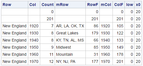
This DATA step adds two observations to the beginning of the data set. It adds frequencies of 0 (slightly smaller than the minimum) and 201 (the maximum) to each frequency variable. These are accompanied by missing values for each of the categorical variables (Row, Col, mRow, and mCol). When PROC SGPLOT looks at the three frequency variables, it will find the same data range (0 to 201) to use when mapping frequencies to variables. When PROC SGPLOT looks at the categorical variables for creating the graphs, it will see missing values for the first two observations and ignore them. This is an old trick for creating graphs that predates attribute maps: begin your data set with strategic combinations of missing and nonmissing values that influence some aspects of the display (usually colors or group order) but nothing else. Soon we will see that we can use a range attribute map instead of augmenting the data.
The DATA step also adds two constant variables (low = 0 and x0 = 20). Low = 0 provides the low end of the high-low plots, which are used to display the marginal frequencies. X0 = 20 is used as one of the coordinates for the marginal frequencies. The IF 0 THEN MERGE statement provides the names, position, type, and (most importantly) length of each input variable to the DATA step at compile time and before the compilation of the IF _N_ = 1 THEN DO part of the DATA step. This way the variable attributes come from the data sets and not from the assignment statements.
You can use PROC SGPLOT to display the crosstabulation along with the marginal frequencies.
ods graphics on / width=4.9in height=6.2in; proc sgplot data=all1 noautolegend noborder; title 'US Population (in Millions)'; %let c = colormodel=(white cx6767bb cxbb67bb cxdd2255); heatmapparm y=row x=col colorresponse=count / &c; text y=row x=col text=count; %let o = type=bar barwidth=0.95 nooutline &c colorresponse; highlow y=mrow low=low high=rowf / x2axis &o=rowf; text y=mrow x=x0 text=rowf / x2axis; highlow x=mcol low=low high=colf / y2axis &o=colf; text x=mcol y=x0 text=colf / y2axis; xaxis display=(nolabel noticks noline) offsetmax=.32; yaxis display=(nolabel noticks noline) offsetmin=.32 reverse; x2axis display=none offsetmin=.75 offsetmax=.03; y2axis display=none offsetmin=.73 offsetmax=.12; run; |
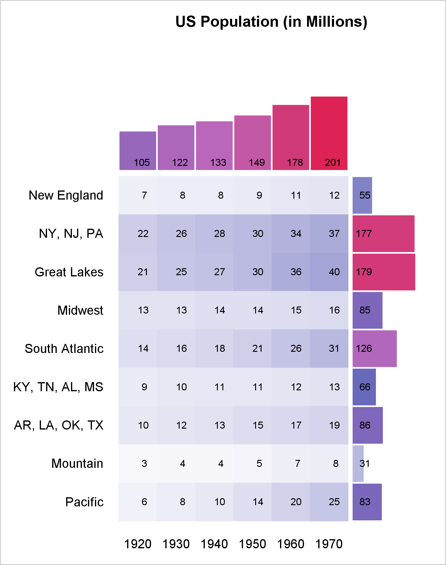
The HEATMAPPARM statement displays the background colors for the crosstabulation, and the TEXT statement displays the frequencies. By default, both use the X and Y axes (bottom and left). The next pair of statements, HIGHLOW and TEXT, use the X2 (top) and Y axes. The final pair of HIGHLOW and TEXT statements use the Y2 (right) and X axes. Each of the four axis statements has one or more offsets, which make it use only part of the graph. The XAXIS statement option OFFSETMAX=.32 reserves 32% of the space on the right for the row marginals. The YAXIS statement option OFFSETMAX=.32 reserves 32% of the space on the top for the column marginals. The XAXIS statement option OFFSETMIN=.75 reserves 75% of the space on the left for the crosstabulation. The Y2AXIS statement option OFFSETMAX=.73 reserves 73% of the space on the bottom for the crosstabulations. These offsets along with the height and width are ad hoc. You will probably need to change them for other data.
Two %LET statements make it easy to consistently specify options that are used in multiple places. The COLORMODEL= option specifies colors that range from white to blue to magenta to red. This option is used in the HEATMAPPARM statement and both HIGHLOW statements. The leading observations ensure that the same color model is used for all three graphs. This example shows how you can control the colors, but not the mapping between counts and colors. A range attribute map gives you more control. Like a discrete attribute map, there are special variables that you must use. See: Range Attribute Map Data Sets. The following steps create and display a simple range attribute map.
data rangeattrmap; id = "myID"; length colormodel1 colormodel2 $ 8 min 8; input max colormodel2; min = ifn(_n_ = 1, 0, lag(max)); colormodel1 = ifc(_n_ = 1, 'white', lag(colormodel2)); datalines; 30 cx6767bb 60 cxbb67bb 201 cxdd2255 ; proc print noobs data=rangeattrmap; run; |
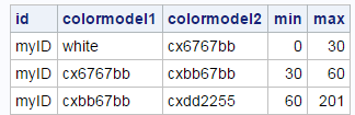
The ID variable contains the ID for this attribute map. The data set can contain multiple range attribute maps, but this one has only one. The remaining four variables specify the first and last color for counts in the range Min to Max. PROC SGPLOT interpolates the colors in between. I deliberately chose smaller count ranges for the first two color ranges so that there would be more variability in the colors in the crosstabulation. You can program the attribute map in many ways. I chose to use instream data and minimize what I put in the instream data. I used programming statement to construct the Min and ColorModel1 variables from the Max and ColorModel2 variables.
Note that you should never execute the LAG function conditionally (as in after an IF THEN or an ELSE) unless you are an expert on the LAG function and you are certain that you know what you are doing. (Conditional execution almost never does what you want.) That advice is followed here, because both the IFN and the IFC functions unconditionally execute both the second and the third arguments (correctly updating the two LAG queues) before deciding which value to return.
The following steps merge the data for use with the attribute map. You do not need to add leading observations to the DATA= data set when you use a range attribute map.
data all2; low = 0; x0 = 20; merge pop f2 f3; output; run; |
This next PROC SGPLOT step is similar to the preceding one. There is no COLORMODEL= option since that information now comes from the range attribute map. The option RATTRMAP=RANGEATTRMAP is specified in the PROC statement, and RATTRID=MYID is specified in the HEATMAPPARM statement and both HIGHLOW statements.
proc sgplot data=all2 noautolegend noborder rattrmap=rangeattrmap; title 'US Population (in Millions)'; %let c = rattrid=myID; heatmapparm y=row x=col colorresponse=count / &c; text y=row x=col text=count; %let o = type=bar barwidth=0.95 nooutline &c colorresponse; highlow y=mrow low=low high=rowf / x2axis &o=rowf; text y=mrow x=x0 text=rowf / x2axis; highlow x=mcol low=low high=colf / y2axis &o=colf; text x=mcol y=x0 text=colf / y2axis; xaxis display=(nolabel noticks noline) offsetmax=.32; yaxis display=(nolabel noticks noline) offsetmin=.32 reverse; y2axis display=none offsetmin=.73 offsetmax=.12; x2axis display=none offsetmin=.75 offsetmax=.03; run; |
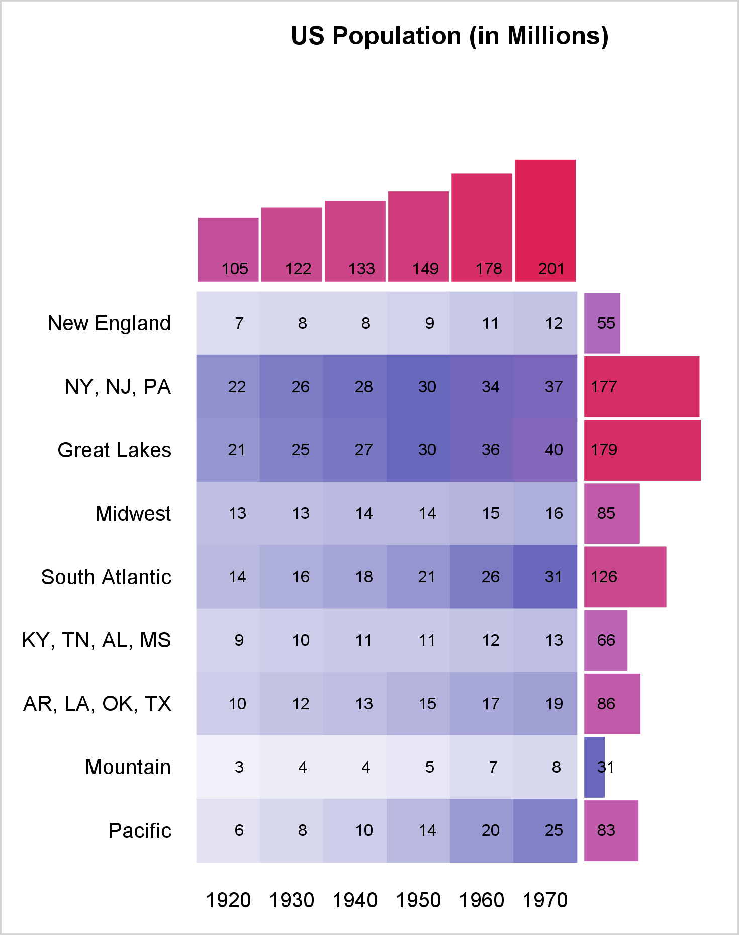
Notice the greater range of colors in the crosstabulation. I have been a big fan of discrete attribute maps for several years. Now, I am also a fan of range attribute maps too! I like having complete control over the color model. Range attribute maps enable me to specify as many color ranges as I want and completely control the colors that correspond to each range of data values.

2 Comments
Good stuff. 9.3? 9.4? Technical Release? would be nice to specify.
Thanks! Range attribute maps appeared in 9.4M3. I will add that info to the body of the blog as well.